Indofast
Rider App
Launching a Battery Swapping Experience to EV Drive Rider
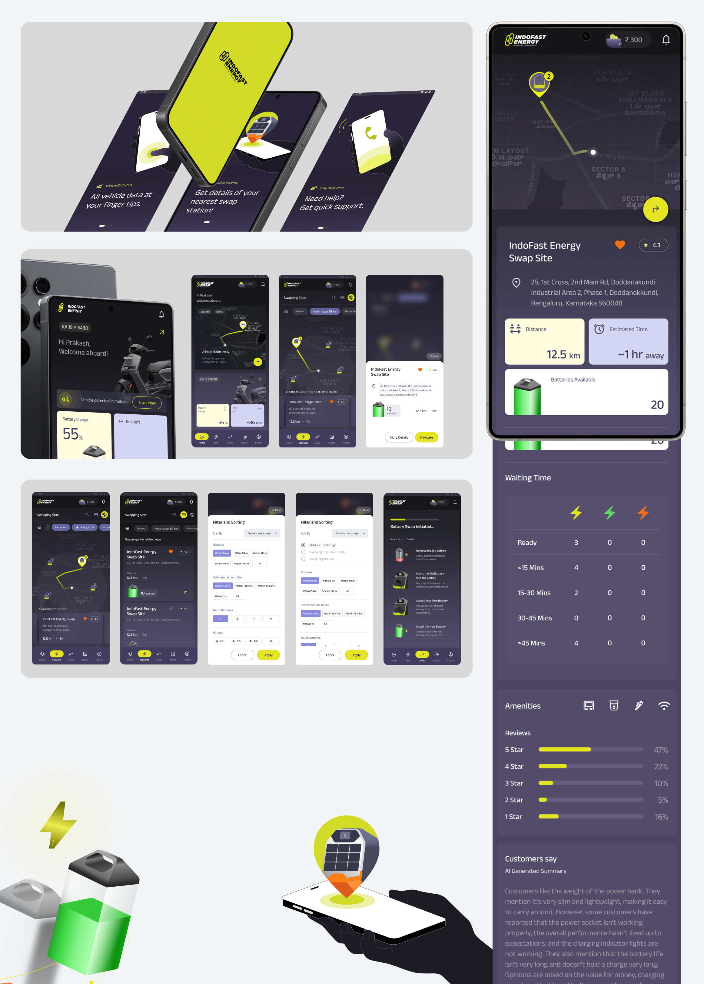
IndofastEnergy, a joint venture between BPCL and Sun Mobility, aimed to build a dedicated Rider App that enables end users to locate and navigate to battery swapping stations, pay for the battery, and manage their wallet and subscriptions. Previously, riders interacted with a WhatsApp bot that offered limited functionality and scalability. The business goal behind the new app was to onboard new users, expand operations into multiple zones and cities, and optimize the overall battery swapping ecosystem.
platform
Androidindustry
Automotive Industry, Energytype
Native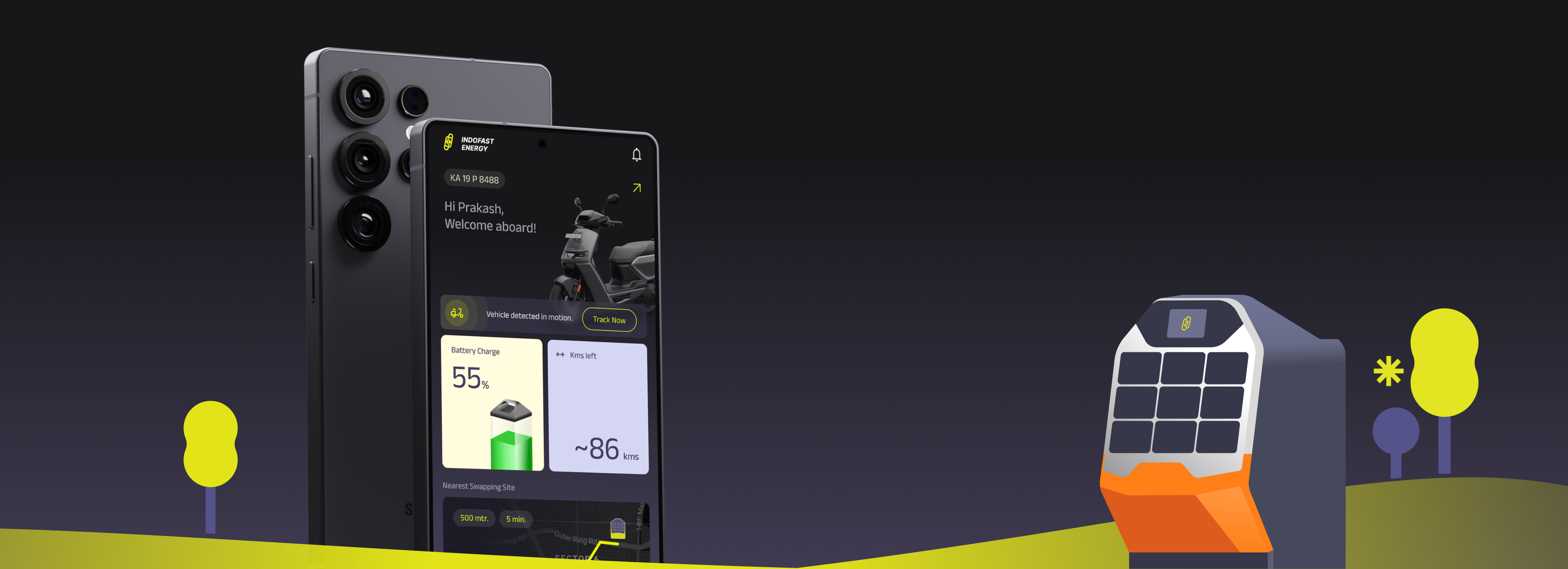
Problems
Limited Usability and Reach
Riders currently interact with Indofast services through a WhatsApp bot that offers very limited functionality.Many riders are either unaware of the bot’s existence or find it difficult to use, resulting in low adoption and engagement.This lack of accessibility restricts Indofast’s ability to onboard new riders and provide a consistent digital experience.
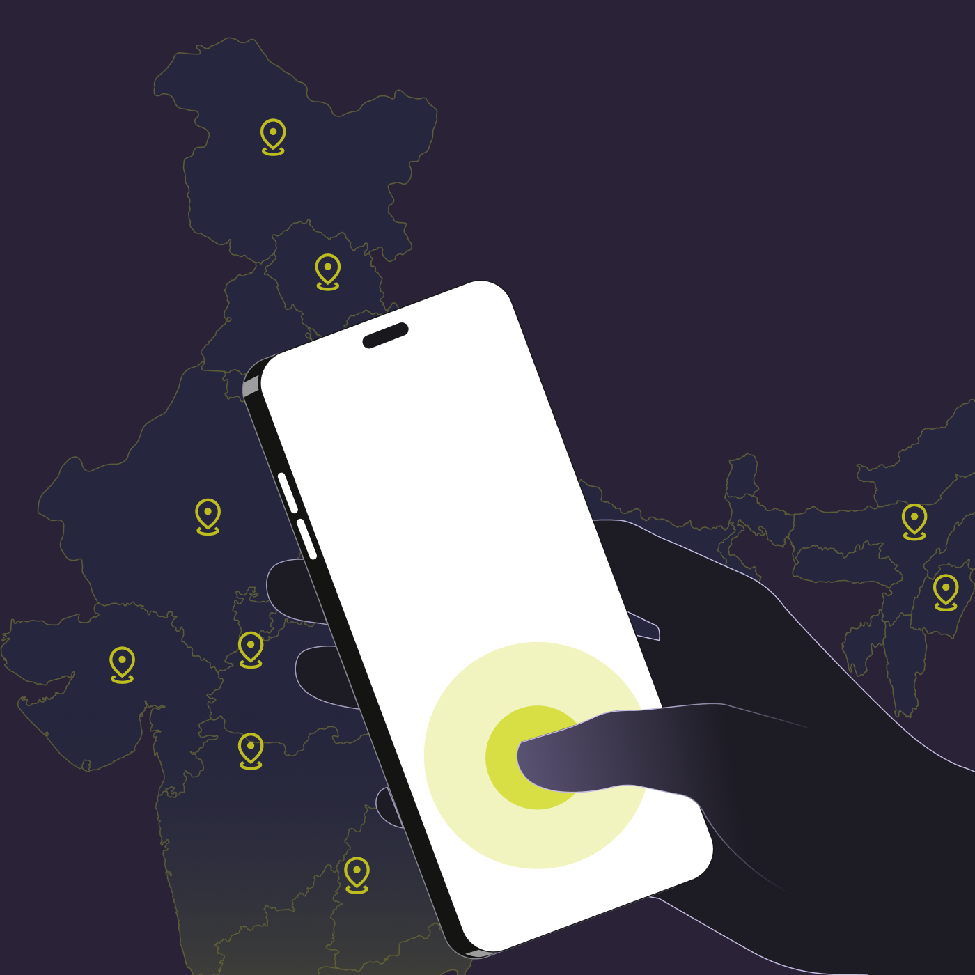
Swapping Site Visibility and Battery Availability
Serviceable Zones and Battery Health
Security and Misuse
Product Research
Product Design
User Exeperience Design
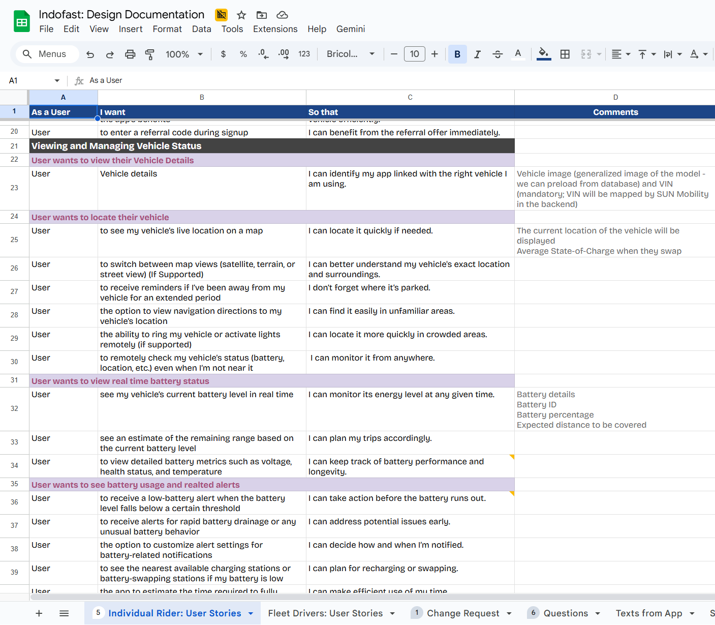
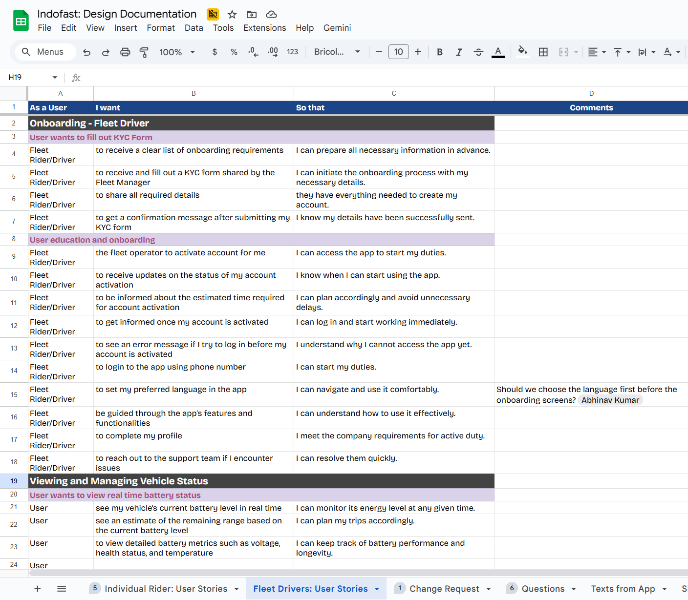
User Stories
After completing the research phase and identifying the core pain points to be addressed in the design, we began drafting detailed user stories that outlined the goals, behaviors, and needs of each persona. We created separate user stories for each persona—while some flows and interactions overlapped, several core experiences were unique and specific to their respective user types. These user stories were then reviewed collaboratively with the client team to validate our understanding, identify any gaps or ambiguities, and ensure alignment before moving forward. User stories continued to evolve throughout each stage of the design process based on the feedback we received.
User Flows
We started mapping out the user journeys in FigJam, bringing all the user stories together into cohesive user flows. The file was shared with the client team for discussion and feedback. Each flow was annotated with comments and notes to explain the reasoning behind design decisions and to make our thought process transparent. Our goal was to ensure that no critical step was missed or incorrectly represented; therefore, based on the feedback received, we refined and updated both the user flows and corresponding user stories to achieve full alignment before moving into wireframing.
Wireframe
The wireframing stage was where ideas began to take visual and logical shape, allowing the client to see the user flows in action. Before starting, we held an alignment call to reprioritize key flows and deprioritize others based on current business needs. Some flows were still awaiting decisions around technical feasibility and business goals, so we designed them in a flexible way that could accommodate future updates without disrupting the overall user experience.
Once the plan was finalized, we created shared trackers and design files for transparent collaboration, enabling the client team to review progress and provide real-time feedback. As more stakeholders became involved, feedback began to overlap and occasionally conflict, which made it difficult to consolidate direction. To resolve this, we requested the product manager (the primary internal point of contact) to collect and share consolidated feedback after internal alignment. This streamlined communication and helped the design team implement changes efficiently. We also established two recurring weekly review sessions to capture feedback, align decisions, and iterate quickly.
To accelerate iteration, we developed reusable components at the wireframe level, enabling the team to update, modify, and create designs more efficiently. This approach significantly reduced design turnaround time and allowed the team to focus on higher-value design decisions.
User Interface Design
To optimize efficiency, we structured the UI phase into multiple steps and ran independent activities asynchronously whenever possible, allowing the team to progress without waiting for dependencies. The key steps wereOne of the biggest challenges during UI exploration was designing an interface that felt modern and minimal yet remained lightweight and accessible for users with low-powered, budget smartphones—many of whom were from developing regions with limited digital literacy. To address this, the team conducted comparative research of existing apps to understand how established brands design for similar constraints and user groups. We analyzed popular social media, ride-sharing, and e-commerce apps to see how they optimized their interfaces for users on low-powered devices with limited resources. Our evaluation focused on a few key questions:
Product Branding
We developed a foundational product branding based on the client’s marketing-focused brand guidelines. The goal was to define visuals to create a framework that would guide the overall product experience. This work ran in parallel with other activities, so once the branding was finalized, the UI team could start implementation without delays. These guidelines were used to build the branded design system, ensuring consistency and efficiency across all UI components.
Design System & Components
We based our design system on Material 3 guidelines to ensure it captured the best Android-native experience. Once the UI direction was finalized, we began building the design system, starting with general components commonly used in Android mobile interfaces. Next, we refined and styled the components developed during the wireframe stage, preparing them for seamless use during UI implementation. This approach ensured consistency, efficiency, and a smooth transition from design to development.
UI Exploration
During the UI exploration phase, we focused on aligning the product’s visual language with the client’s brand identity and their perception of market positioning. I led the team in developing three distinct visual style directions to provide the client with clear options and stimulate discussion around their brand aspirations. Through collaborative feedback sessions, we iterated on the selected direction, refining it to balance user experience, brand consistency, and technical feasibility. This approach not only ensured the client’s vision was accurately represented but also provided a structured framework for decision-making, resulting in a final UI that was both visually compelling and strategically aligned with the product’s positioning.
Transformation
We began applying the UI to the prioritized wireframes while scaling the design system as the project progressed. As the app started taking its final shape, new ideas emerged, which we incorporated through continuous improvements. During this process, we also updated the corresponding user flows and user stories, ensuring the evolving design remained aligned with both user needs and business goals.
Constraints
Since most fleet drivers are local, with limited formal education and fluency only in their native language, the app needed to support multiple languages to ensure accessibility and ease of use.
Challenges
Unresolved Approval Journey
Indofast was a joint venture between ICOL and Sunmobity, and it was leveraging the technology and IP developed by the parent subsidiaries. This dependency limits the development of new experiences and features in an optimized way. For example - Login flow was one of the crucial experiences that identifies the type of users – fleet or individual – to load the features accordingly. If the user type is individual then the flow is starting forward but in case of fleet, they have to go through the approval process. This approval process was yet to be finalized by the Sun mobility hence we had no clarity on how exactly this approval process is going to work. This is one of the few examples where lack of clarity in the process halted or delayed the design.
Innovation Behind Approvals
To accelerate the design and development process, the team proposed using third-party plugins for auxiliary modules such as payments, ticketing, chat, referrals, and reviews. However, since some of these integrations were already adopted by the parent subsidiaries, Indofast was advised to use the same solutions to avoid potential conflicts or compatibility issues. Any new integrations had to go through the parent company’s approval and implementation process, which added extra dependencies and caused delays in development.
Lack of Infrastructure & Data Readiness
One of the key business goals of the app was to deliver real-time updates on the user, vehicle, battery, and station status, enabling riders to make informed decisions, stay aware of potential risks, and ensure a seamless and safe riding experience. However, the backend infrastructure was not fully ready to support many of these real-time capabilities—only a few data points were functional at the time. This limitation required the team to assess which features could be implemented immediately and which would depend on future backend development. For those requiring new data flows, close collaboration with the technical team was necessary to define expected behaviors. Each of these decisions had to go through an approval process involving the parent company, which led to delays, extended timelines, and multiple design iterations.