Dimagi
CommCare
Redesigning the CommCare App to Help Frontline Workers Transition from Legacy to Modern Workflows
The project focused on transforming the in-app experience to help frontline workers transition from a legacy app to a modern, intuitive experience. The redesign aimed to reduce workflow complexity, minimize user confusion, and provide better visibility into user states. It also included a visual modernization of the interface, aligned with updated brand guidelines and implemented thoughtfully within existing technical and product constraints.
platform
Androidindustry
Healthcaretype
Native
Outcome

Improved Workflows
Improved the in-app experience by simplifying the information architecture and unifying workflows.

Scalable Design system
Established a scalable/extendable design system based on material design 2 guidelines.

App Modernization
Modernized the app by implementing the design system, achieving visual consistency and a cohesive user experience with reusable components.
Impact
Increased App Install
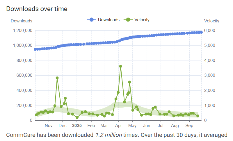
The redesigned app surpassed 1.2 million total downloads, achieving a peak velocity of 5K–6K downloads per day during the rollout phase after a focused three-month development cycle.
1.2M
Problems
Overlapping Workflows
The app combined both legacy and modern workflows within the same experience, resulting in inconsistent navigation patterns and confusion.
Lack of Clarity Around User Data and States
Outdated and Inconsistent Interface
Product Research
Audit
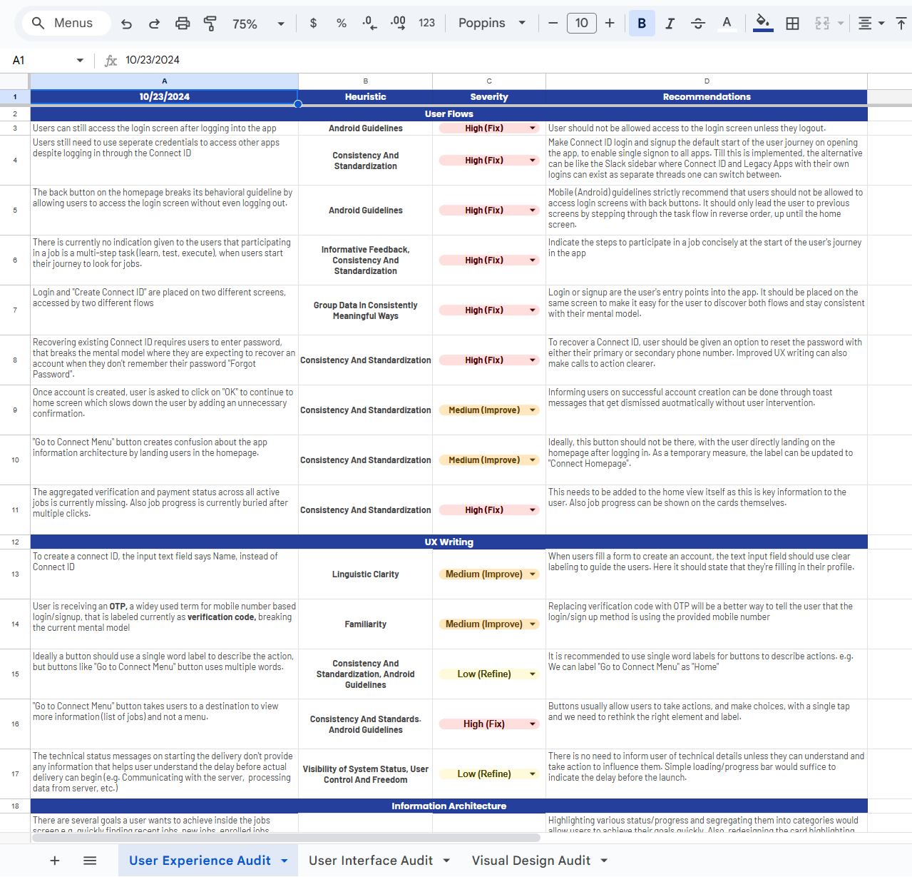
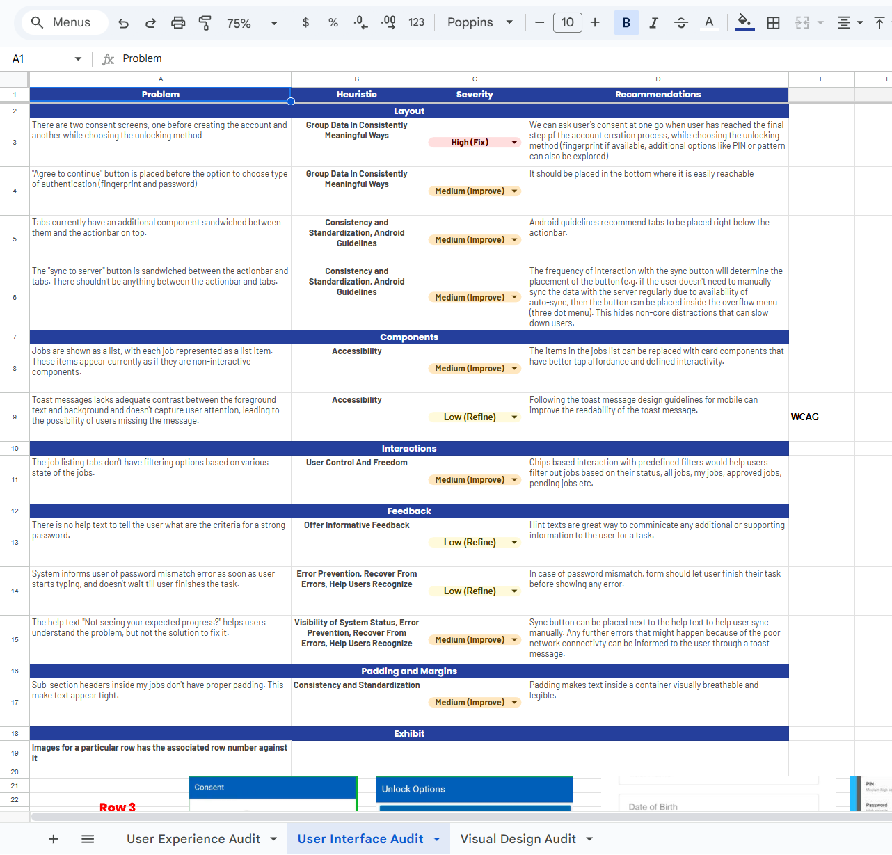
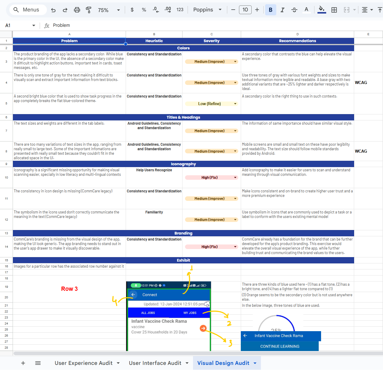
The project began with a thorough design audit grounded in design heuristics. We analyzed the mobile app against the heuristics principles and structured the audit into three main sections — UX, UI, and Visual Design. Each section included its own set of focus areas under which we conducted a detailed evaluation and prepared a comprehensive report outlining key problems and actionable recommendations along with the examples from the other apps how they are following the design heuristics to present the same or similar experience. Since the app was primarily Android-based, we used Material Design 2 guidelines as the foundation for our assessment.
Product Discovery & Walkthrough
The next step focused on understanding the core purpose of the mobile app and how it fits within the broader business ecosystem. We explored how the app supports frontline workers, connects with other internal applications, and enables users to complete key tasks and actions. To gain a complete picture of its functionality, we mapped user goals, workflows, description flow, and app-specific terminology. The client also shared valuable context on why this transformation was necessary and what outcomes they aimed to achieve.
To accomplish this, we structured a multi-stage product discovery and walkthrough process, documenting our findings in FigJam and validating our understanding collaboratively with the client team. The app had recently introduced modern workflows while retaining legacy ones to support existing users — a decision that created confusion and added unnecessary complexity. Our goal in this phase was to understand how these overlapping workflows affected the overall user experience and to identify clear pain points and opportunities for improvement.
Product Design
User Exeperience Design
User Stories
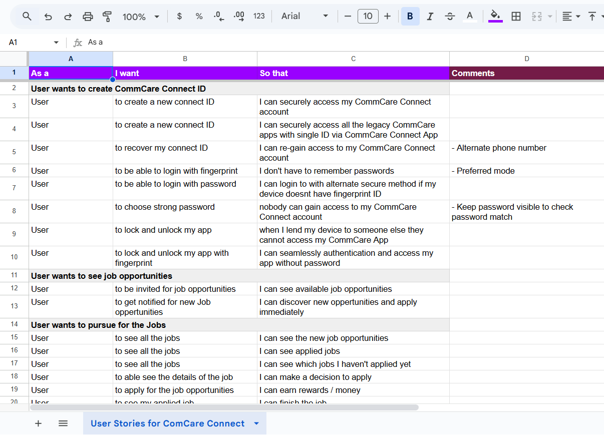
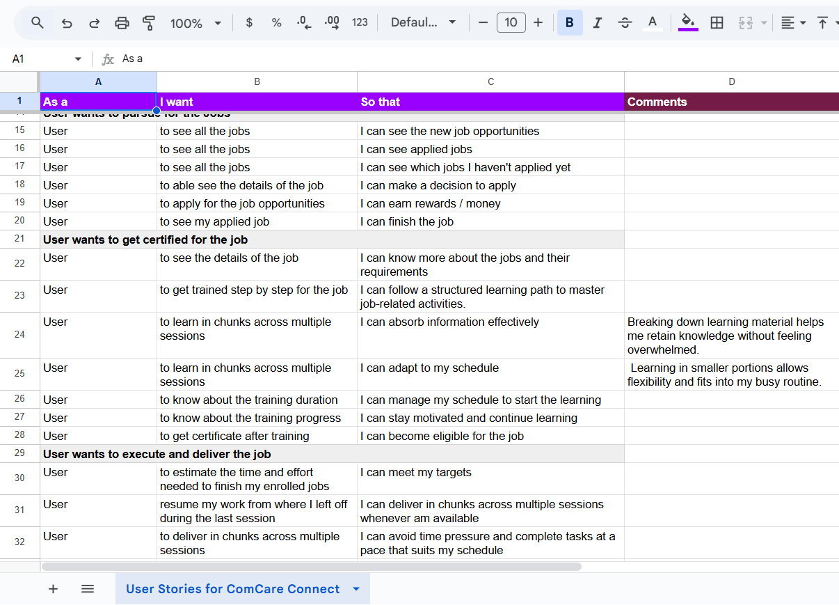
Once the first round of discovery calls was completed, we began documenting user stories categorized under Epics, Features (Tasks), and User Stories, along with detailed comments to ensure nothing from our discovery sessions was missed and that every aspect reflected our mutual understanding. These stories were refined through our thrice-weekly alignment sessions, helping us validate details and maintain consistency before moving to the next stage.
As the design process evolved, we kept updating and expanding these user stories to capture new insights and decisions. Since the client didn’t have any internal documentation or system to manage their user stories, this exercise provided them with a concrete, structured, and ready-to-develop feature set. We also continued to run interim discovery sessions throughout the process to help the team clarify queries, validate assumptions, and gain a deeper understanding of the product.
User Flows
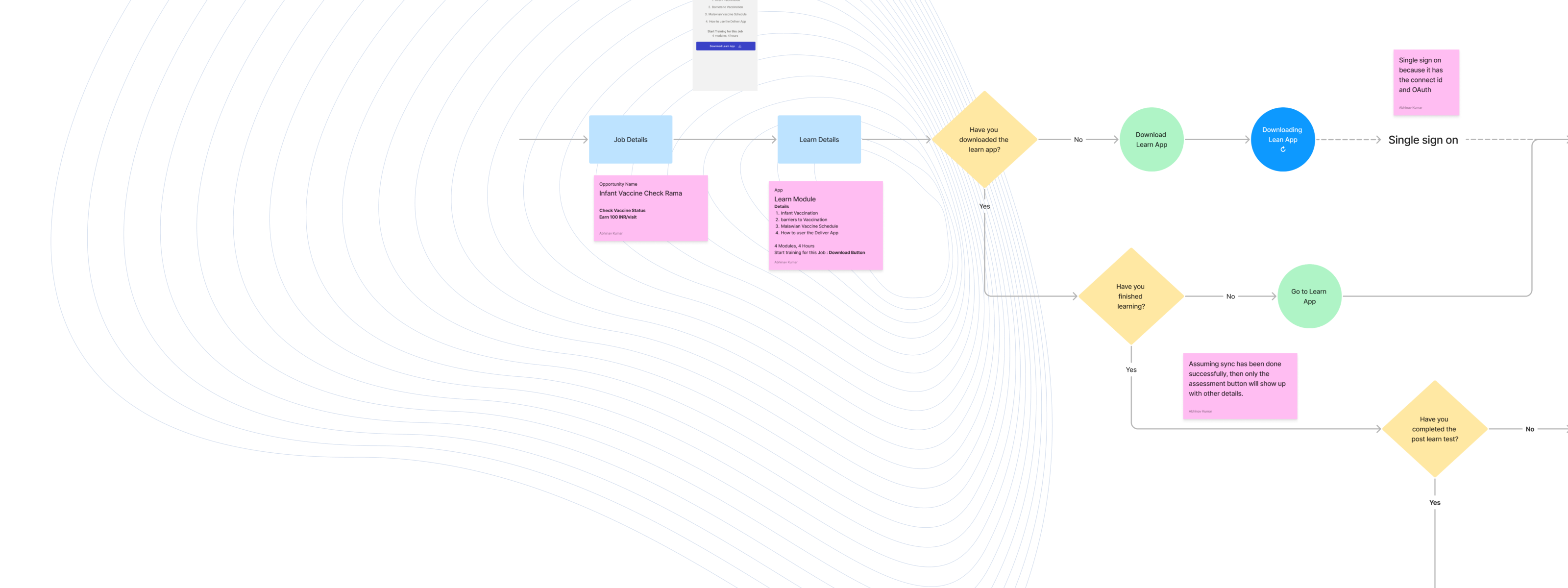
Next, we set to focus on detailing, optimizing, and restructuring the user flows captured earlier, with the goal of addressing the issues, complexities, and points of confusion identified during the audit and product discovery phases. We planned a two-week collaborative sprint, working both synchronously and asynchronously with the client on FigJam to incorporate real-time feedback and ensure alignment at every stage. To maintain momentum and accelerate decision-making, we established an alternate-day review cadence, enabling rapid iteration, validation, and refinement—ultimately leading to the finalized user flows.
Wireframe
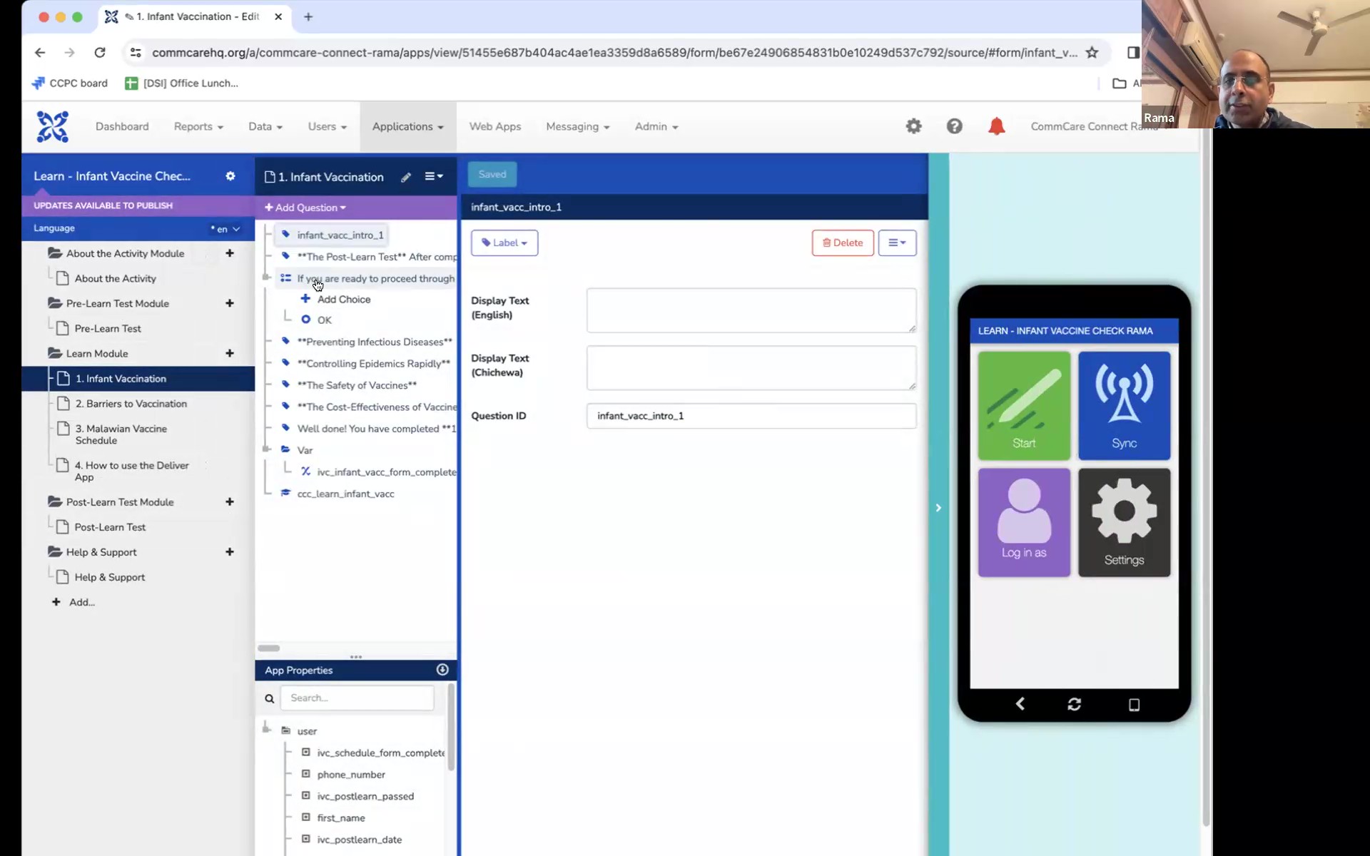
At this stage, we built a minimal reusable design system at the wireframe level to enable faster iteration and smoother collaboration during our twice-weekly feedback sessions. Since the target user group was from developing countries and rural or backward areas, they didn’t have access to the latest high-end smartphones and mostly used low-powered, budget devices with smaller screens and limited processing capacity. With this in mind, we asked the client to identify target screen sizes based on their user base distribution, from which we selected the top three screen sizes to optimize the design. Although we didn’t design for all screen sizes initially, we started with a 360x590 screen as the base since it was the most commonly used screen size among target users. We focused on refining the wireframe’s layout, information structure, and flow to accurately capture all user stories and ensure a smooth user experience on the chosen screen size, while designing it in a way that would remain responsive or require only minor adjustments for other devices.
As the wireframes evolved, the client was able to visualize the product more clearly, which led to richer and more actionable feedback. Based on these discussions, we updated the user flows and user stories to ensure complete alignment with user needs and business goals. We conducted several rounds of brainstorming and iteration, fine-tuning each element to achieve the most effective design outcome.
To maintain clarity and accountability, we shared Figma design files along with a change tracker in Google Sheets, documenting every iteration and decision made. This helped us avoid redundant revisions, resolve feedback efficiently, and ensure that no critical details were lost along the way. In parallel, we sent weekly email updates summarizing progress, pending items, client-side dependencies, and key decisions made, keeping everyone informed and aligned throughout the process.
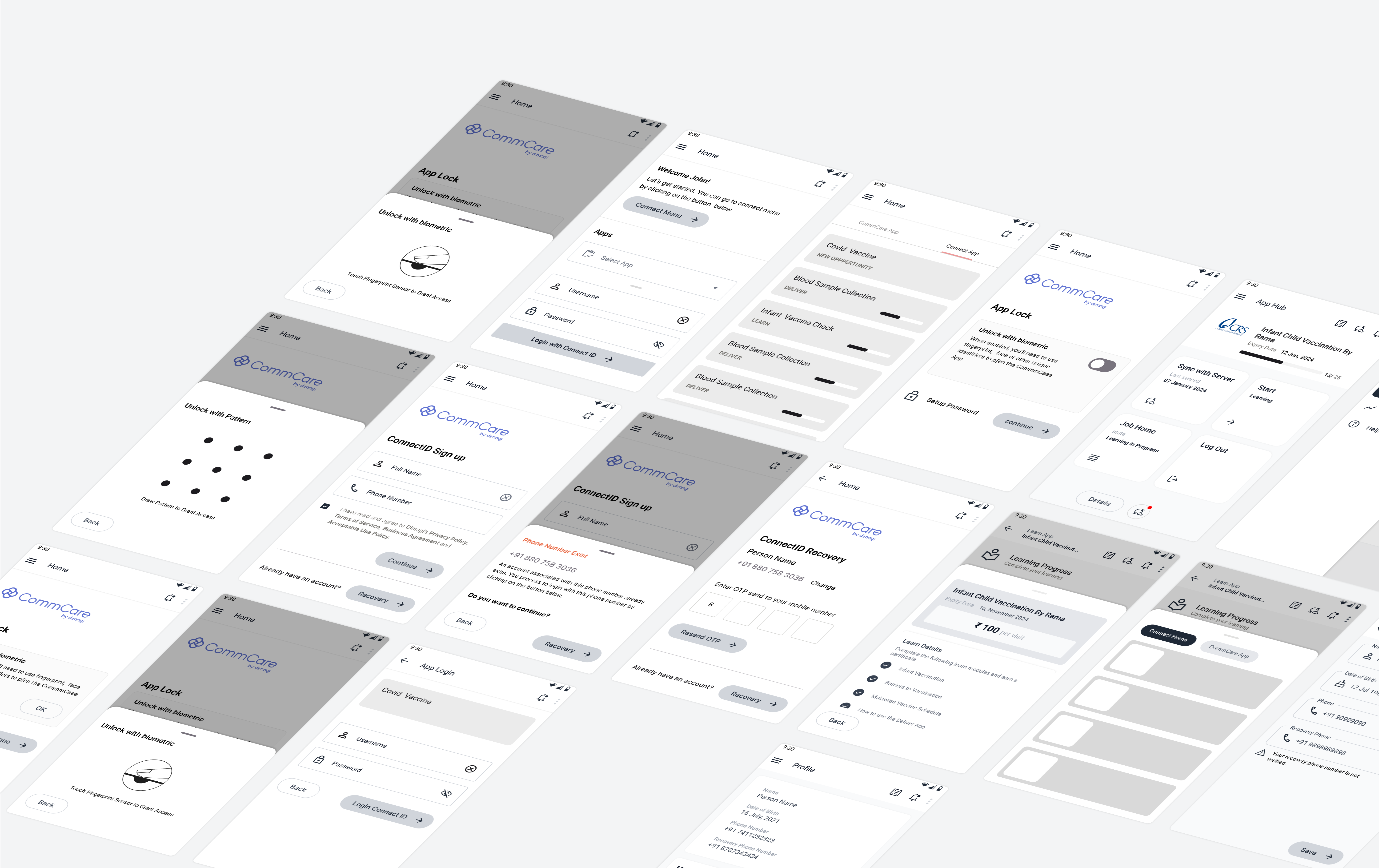
User Interface Design
The UI design phase was structured into three key stages — Product Branding, UI Exploration, and UI Implementation. We began by developing the product’s branding, drawing inspiration from the existing marketing brand guidelines to ensure visual and tonal consistency across platforms. In parallel with the wireframing process, the team explored three distinct UI directions to make the most of available time and optimize the overall workflow. Through multiple discussions and brainstorming sessions, we evaluated each direction for usability, scalability, and alignment with the product’s purpose before finalizing the one that best balanced function and aesthetics.One of the biggest challenges during UI exploration was designing an interface that felt modern and minimal yet remained lightweight and accessible for users with low-powered, budget smartphones—many of whom were from developing regions with limited digital literacy. To address this, the team conducted comparative research of existing apps to understand how established brands design for similar constraints and user groups. We analyzed popular social media, ride-sharing, and e-commerce apps to see how they optimized their interfaces for users on low-powered devices with limited resources. Our evaluation focused on a few key questions:
Product Branding
Design System & Components
Exploration
Transformation
Constraints
Device/Platform Limitations
The app needed to function smoothly on low-powered smartphones commonly used by frontline workers, requiring design and technical decisions optimized for performance and simplicity.
Coexistence of Legacy and Modern Workflows
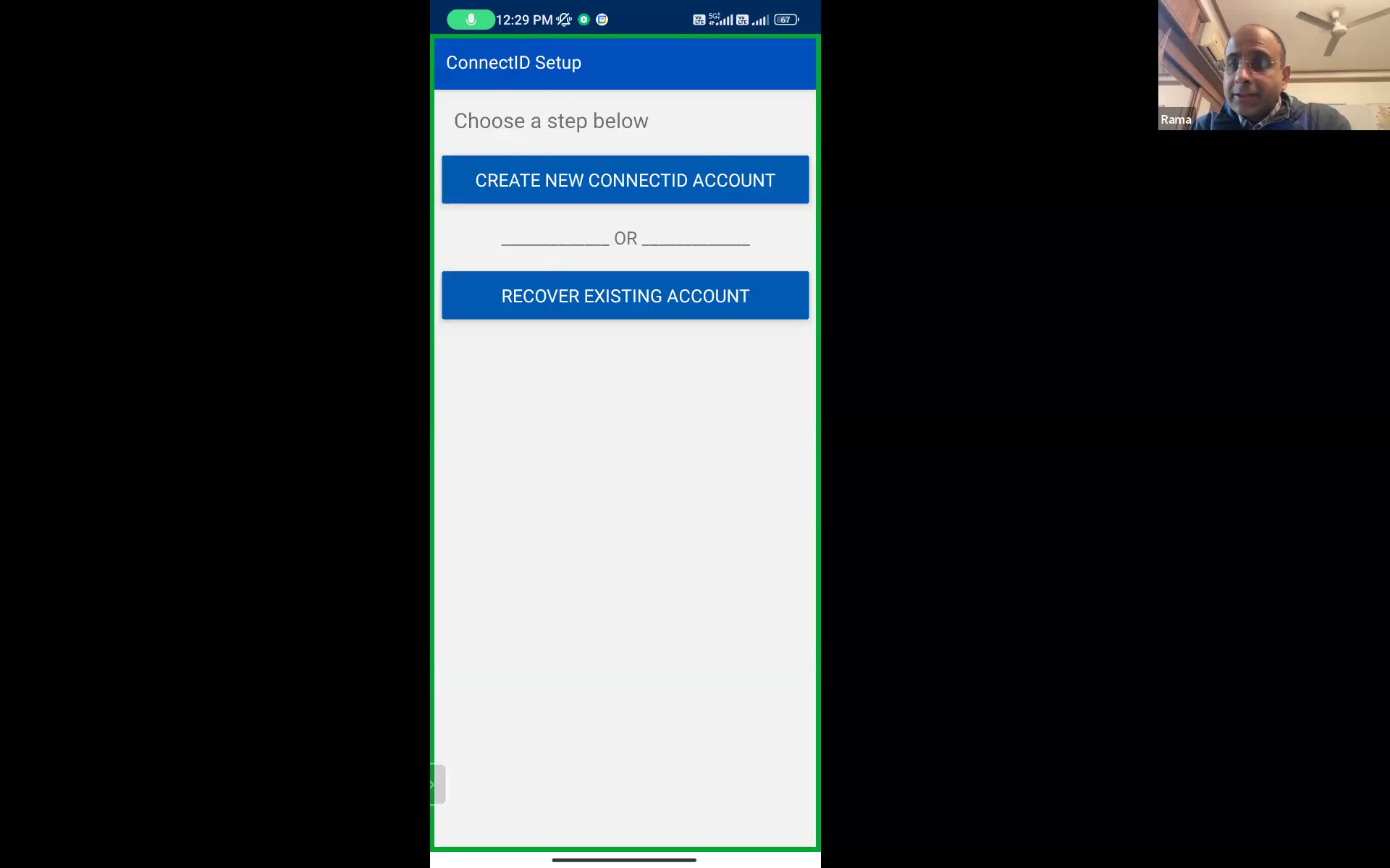
Both legacy and modern experiences had to be supported within the same app during the transition period, with a long-term goal of fully migrating users to the modern workflow.
Design Simplicity and Accessibility
The visual design had to be minimal, modern, and easy to navigate for users with limited digital literacy—balancing aesthetics with clarity and usability.
Challenges
Limited Direct User Access
Reaching frontline workers for interviews or usability testing wasn’t feasible due to their geographic distribution and field constraints.
Relying on Secondary Insights
User insights and behavioral understanding were primarily shared through the product manager and client team, requiring careful interpretation and validation before design decisions.
Takeaway
Communicating Design Decisions
Communicating design decisions to a non-designer product owner wasn’t always easy. I had to justify every choice — either by referencing similar implementations from other apps or by grounding it in design heuristics and usability principles.
Phased Rollout Strategy
Replacing the legacy app with a completely new one would have made user transition harder. A phased rollout turned out to be a more practical strategy, allowing users to adapt gradually without disrupting their existing workflows.